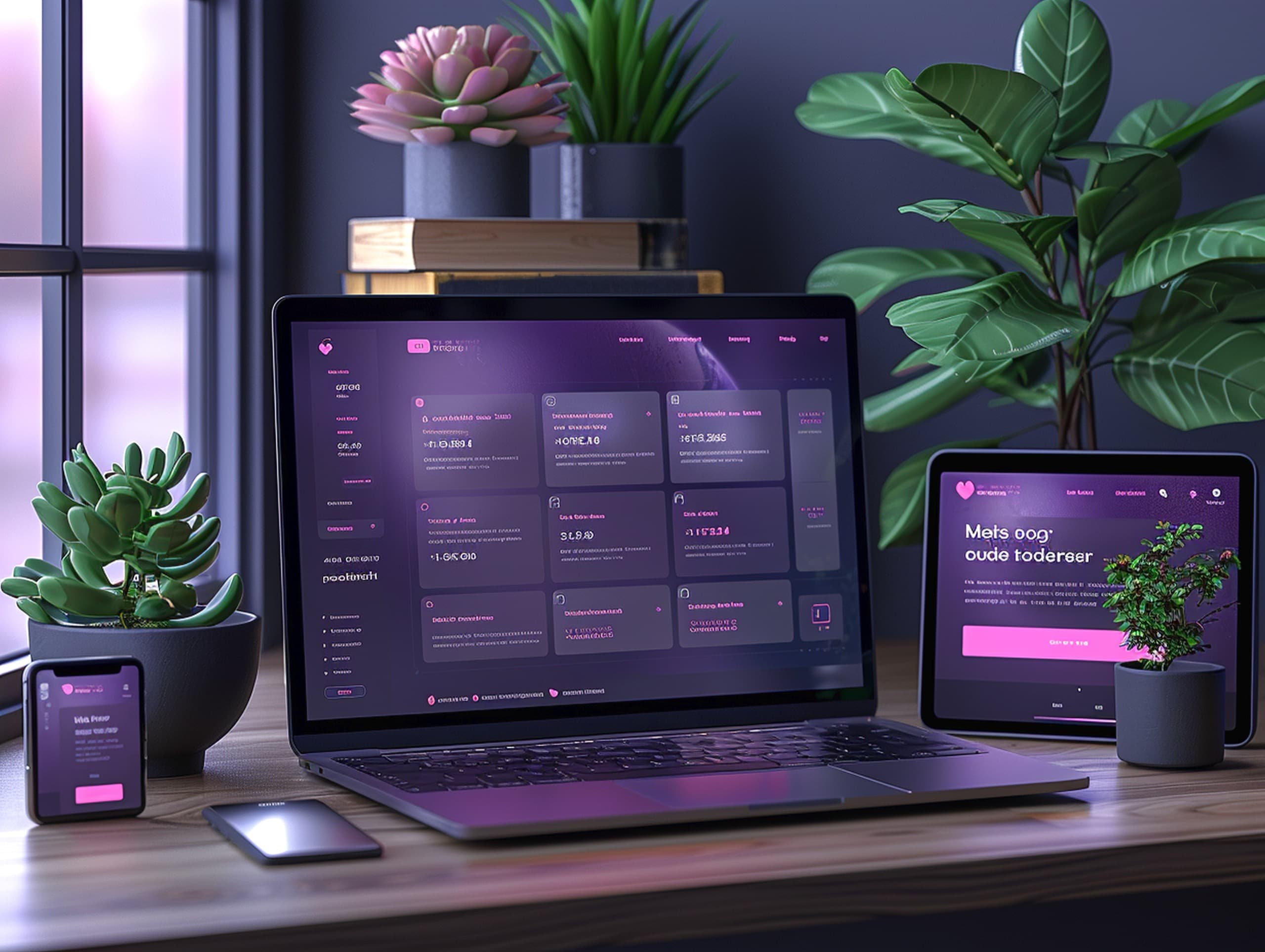
In the present digital era, where users access websites from various devices, it’s crucial to ensure a smooth experience across different screen sizes. With Vasty, you can be confident that your website will appear and work perfectly on all devices, thanks to its exceptional responsive design capabilities. In this blog post, we will delve into how Vasty elevates responsive design to the next level, ensuring your website looks striking and functions seamlessly on desktops, laptops, tablets, and smartphones.
The Importance of Responsive Design
Before we delve into Vasty’s responsive design features, let’s briefly discuss why responsive design is crucial for modern websites. With the proliferation of mobile devices, a significant portion of web traffic now comes from smartphones and tablets. A responsive design ensures that your website adapts dynamically to different screen sizes and orientations, providing users with an optimal viewing and browsing experience regardless of their device.
Vasty’s Responsive Design Approach
Vasty’s responsive design goes beyond just fitting content onto smaller screens. It’s about delivering a consistent and intuitive user experience across all devices. Here’s how Vasty achieves this:
- Fluid Layouts: Vasty’s layouts are designed to be fluid and flexible, allowing content to adapt seamlessly to various screen sizes. Whether a widescreen desktop monitor or a narrow smartphone display, Vasty ensures your content looks great without sacrificing readability or usability.
- Media Queries and Breakpoints: Vasty utilizes CSS media queries and breakpoints to apply specific styles and layouts based on the user’s device characteristics, such as screen size, resolution, and orientation. This enables Vasty to tailor the presentation of content to suit the device’s capabilities and limitations, ensuring an optimal viewing experience at all times.
- Touch-Friendly Navigation: In addition to layout adjustments, Vasty incorporates touch-friendly navigation elements and gestures to enhance usability on touchscreen devices. Whether swiping through image galleries or tapping on menu items, Vasty’s responsive design makes interaction intuitive and effortless for mobile users.
- Performance Optimization: Vasty’s responsive design isn’t just about aesthetics – it’s also about performance. By optimizing images, scripts, and other assets for mobile devices, Vasty ensures that your website loads quickly and smoothly on smartphones and tablets, regardless of network conditions or device specifications.
Testing and Validation
Before releasing any updates or new features, Vasty undergoes rigorous testing and validation across various devices and browsers. This ensures that the responsive design remains consistent and reliable across different platforms, minimizing the risk of compatibility issues or usability concerns.
Conclusion
In conclusion, Vasty sets the standard for responsive design in WordPress themes, ensuring a flawless device experience. Whether your visitors are browsing on a desktop, laptop, tablet, or smartphone, Vasty’s responsive design guarantees that your website looks stunning and functions seamlessly, delivering an exceptional user experience every time.


Leave a Reply